LAA350 - Diagram
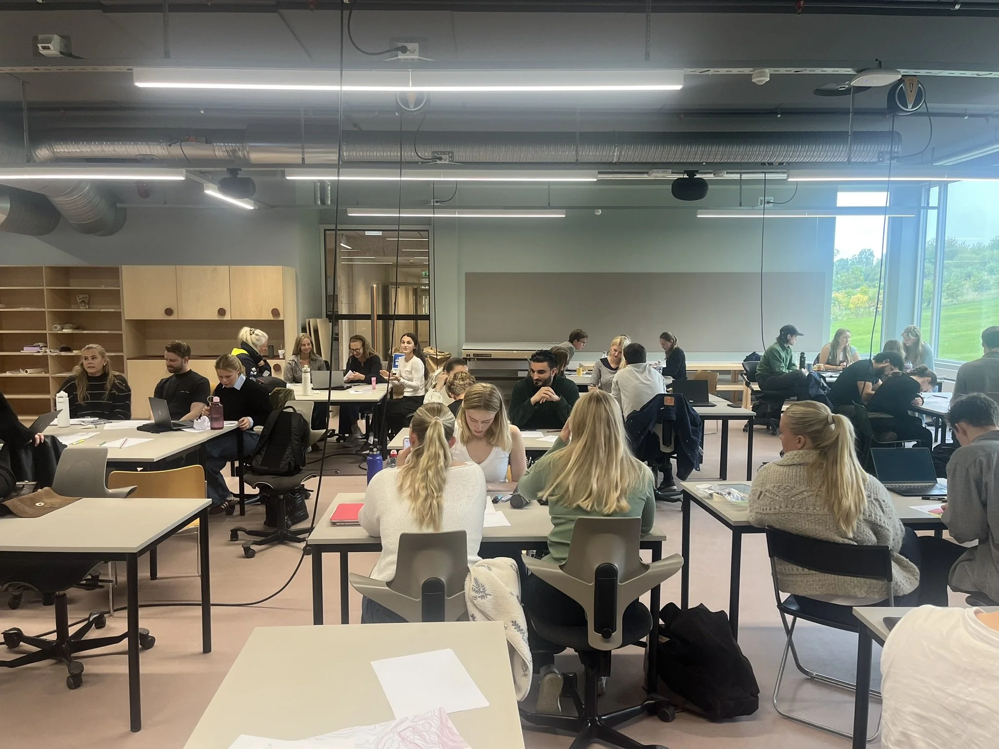
For the fourth time, Tin is bringing Diagram to LAA350. The lecture and workshop invites students from both graphical and non-graphical disciplines to draw, communicate and convince. First a lecture, then an assignment, and finally a pin-up where the drawings have to do some talking. In spatial planning, a plan can show what goes where; a diagram can help explain why….and not least, powerful tools of persuasion and control, if used correctly!
The session is structured as three parts:
Intro — 45 minutes. Tin gives a short lecture on how he uses diagrams in architecture, the social sciences, working life and everyday life, including where technology and drawing meet.
Task — 30 minutes. No sitting this one out. In groups of three or four, students choose a theme related to Fornebu and use an A4 sheet to show its context, problem and proposed solution. The aim is a diagram that can explain itself, with text where useful. Students were organized into groups of 3 to 4 based on their professional backgrounds, including landscape architecture, property development, and regional planning. This grouping was intended to foster comparison and integration of drawing techniques across different fields. Their medium and tools are A4 paper and pencils.
Presentation — 45 minutes. The diagrams go up for a pin-up review and a short discussion in plenary. “Self-explanatory” is the ambition, although Tin will be there to present the task and keep the conversation going.
Tin’s tips:
The simpler, the better.
Work smart, not hard.
Find a balance between drawing and text.
The best submissions explain themselves.
There is no single right answer, but there are many interesting ones!
The final product of this workshop are presented below:
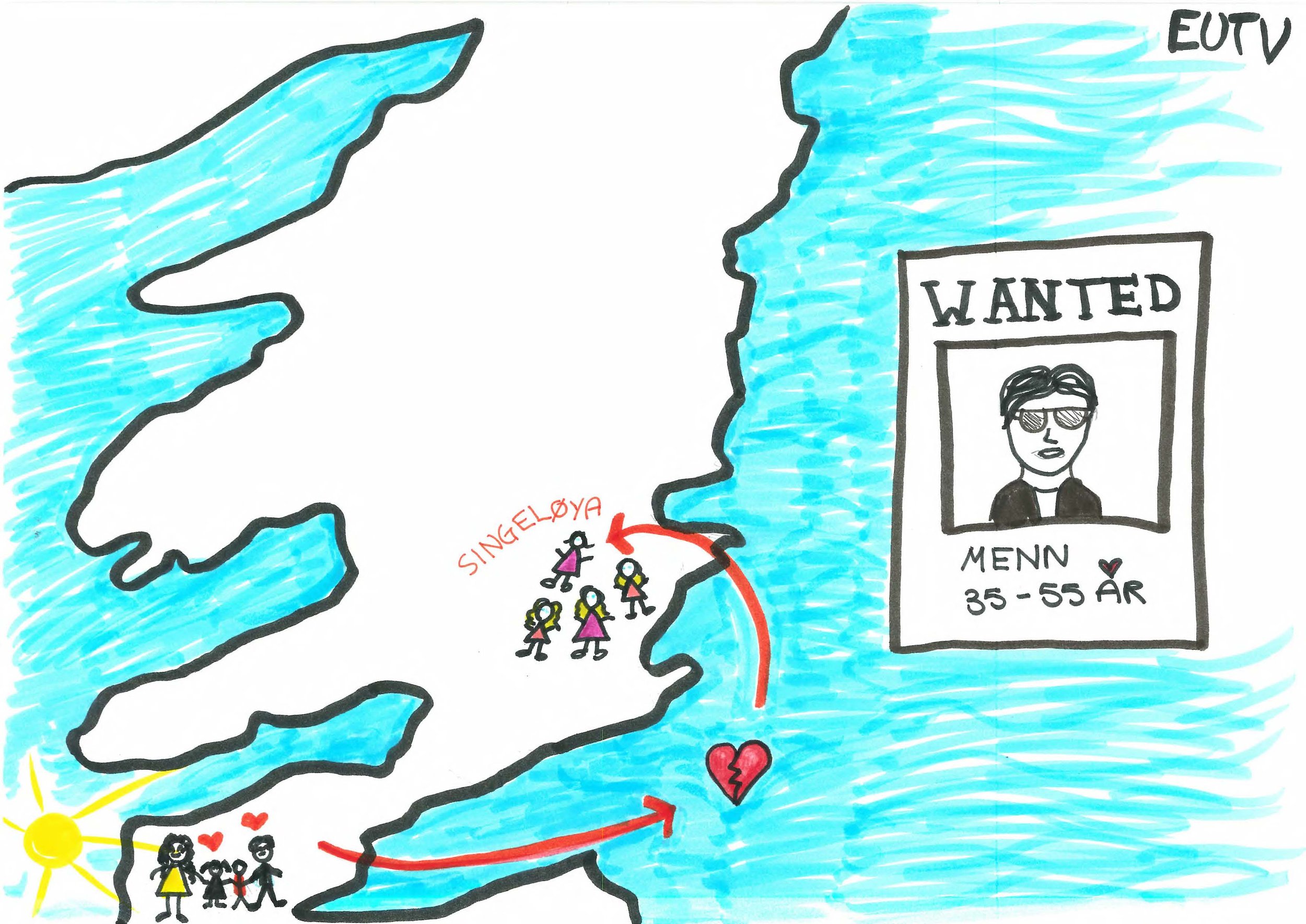
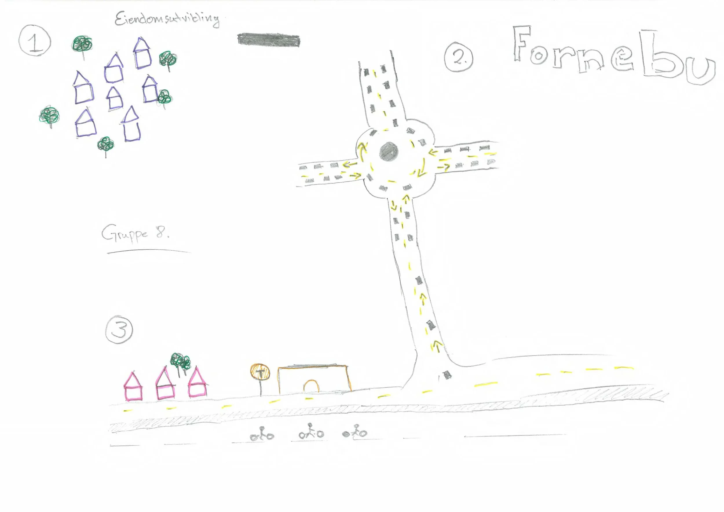
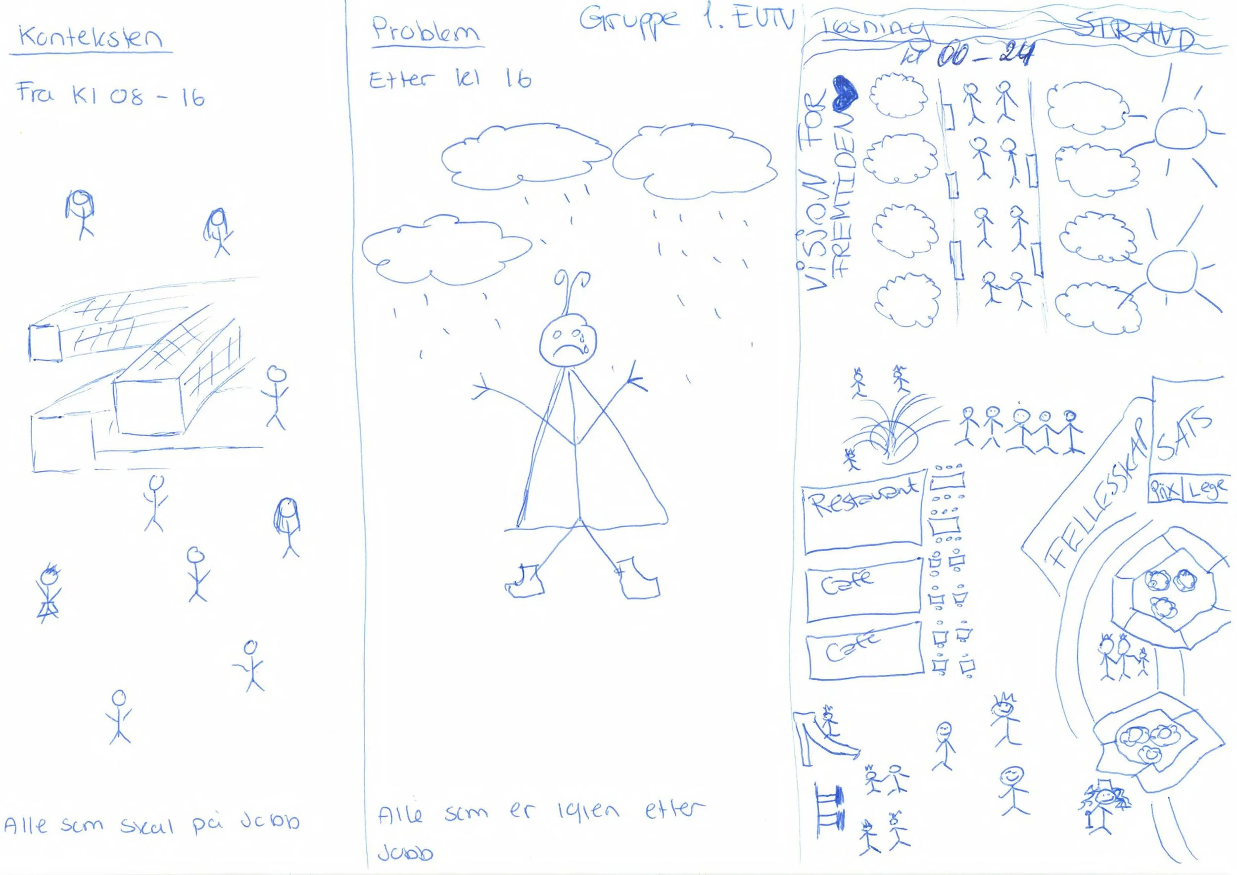
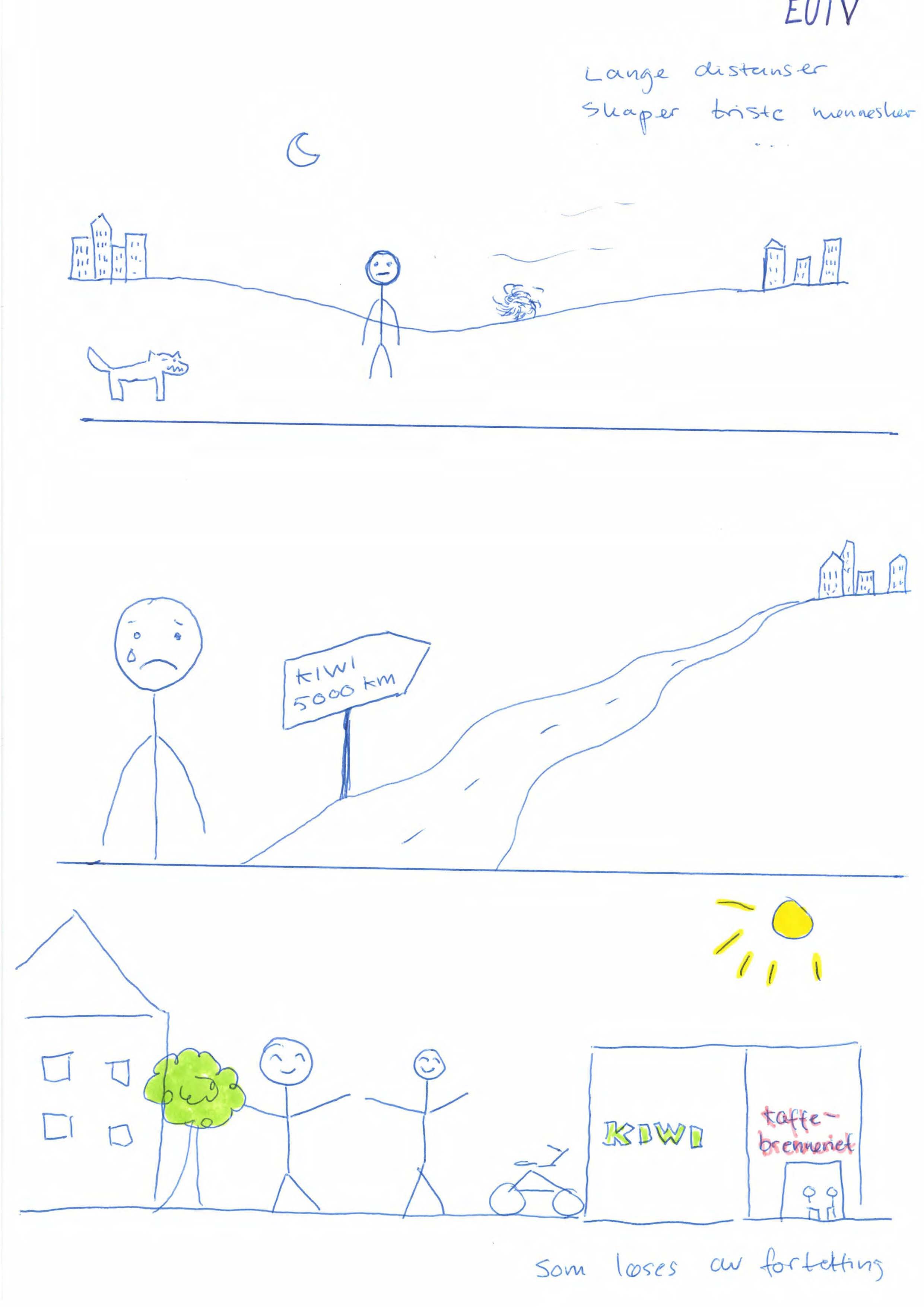
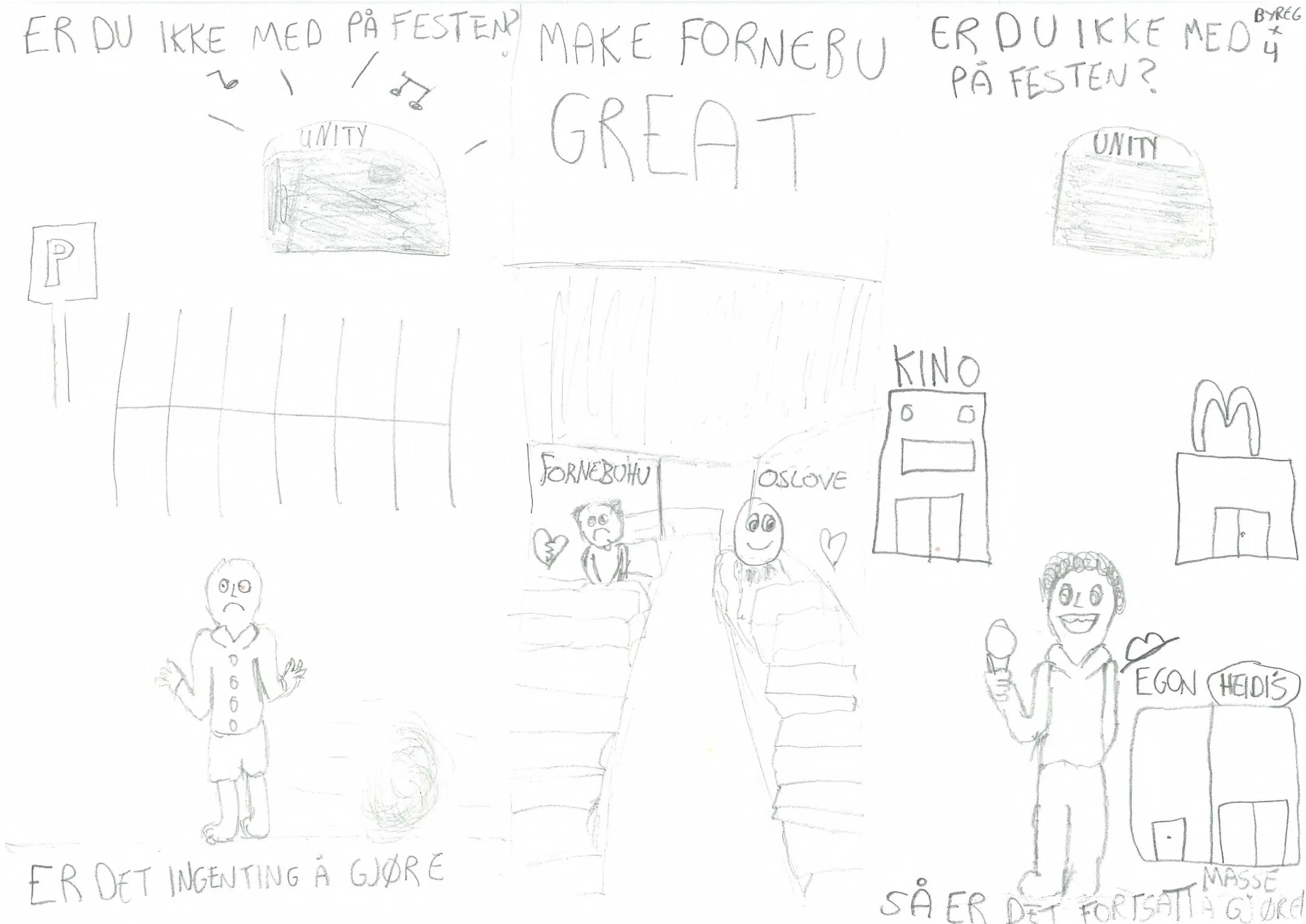
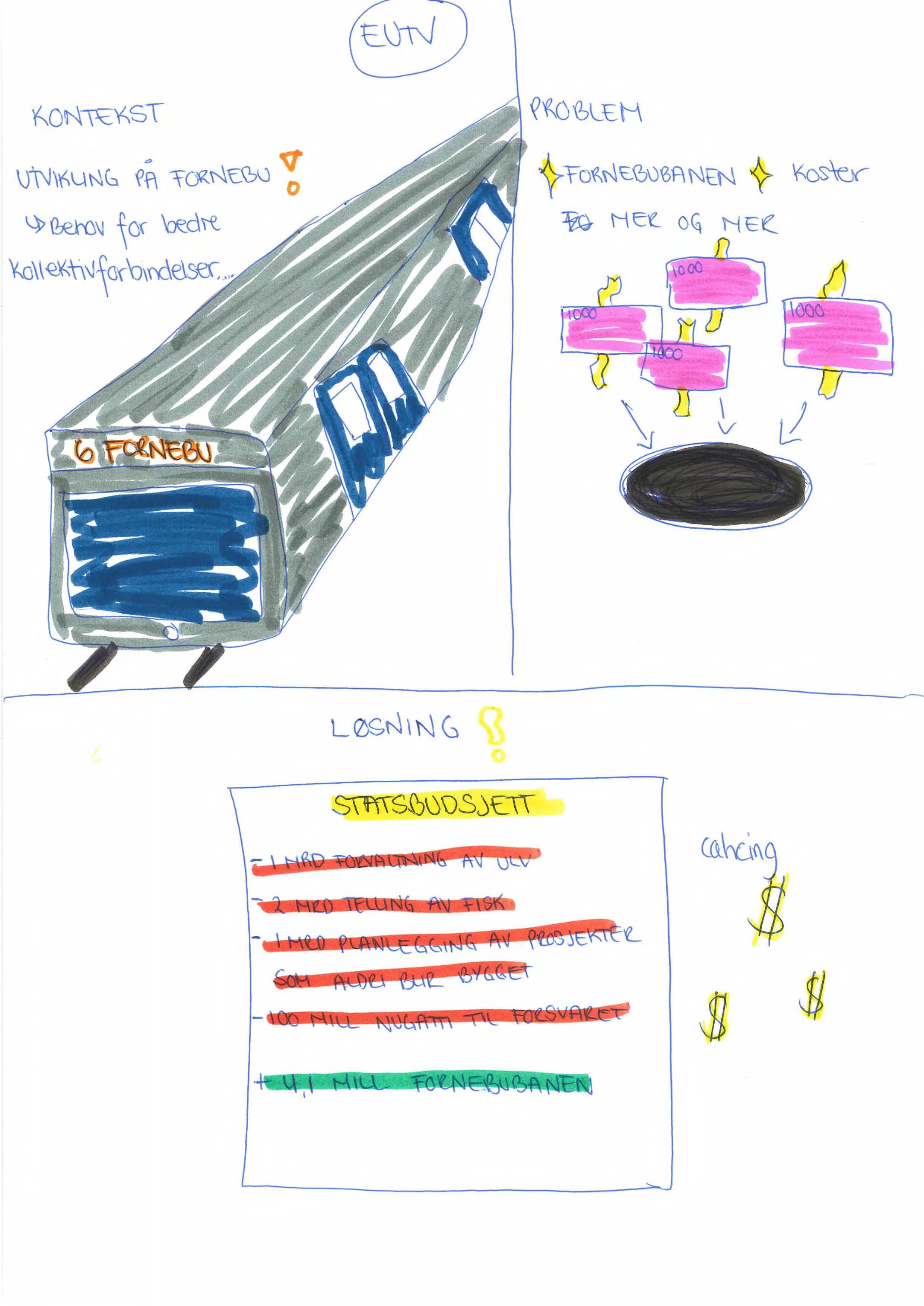
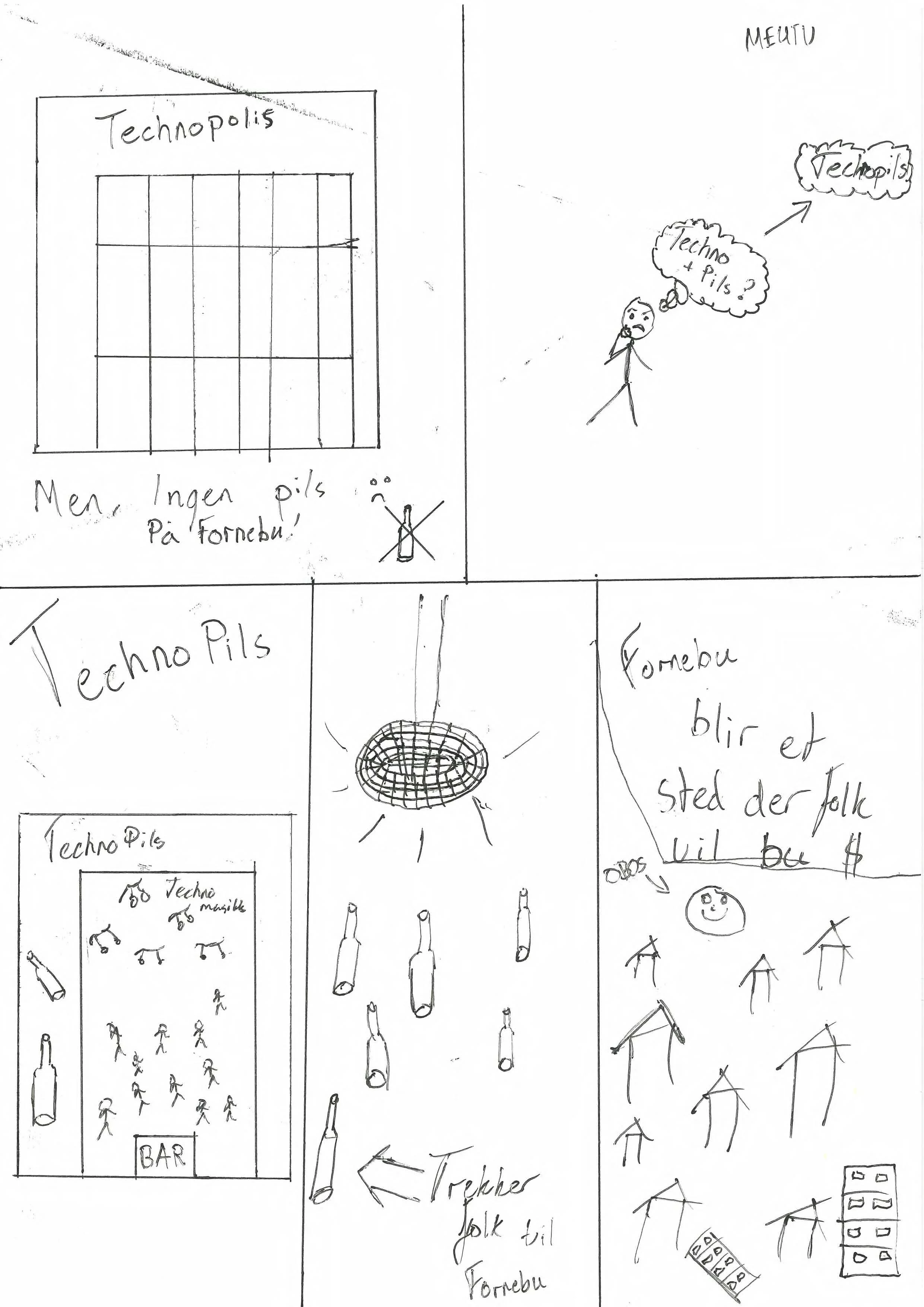
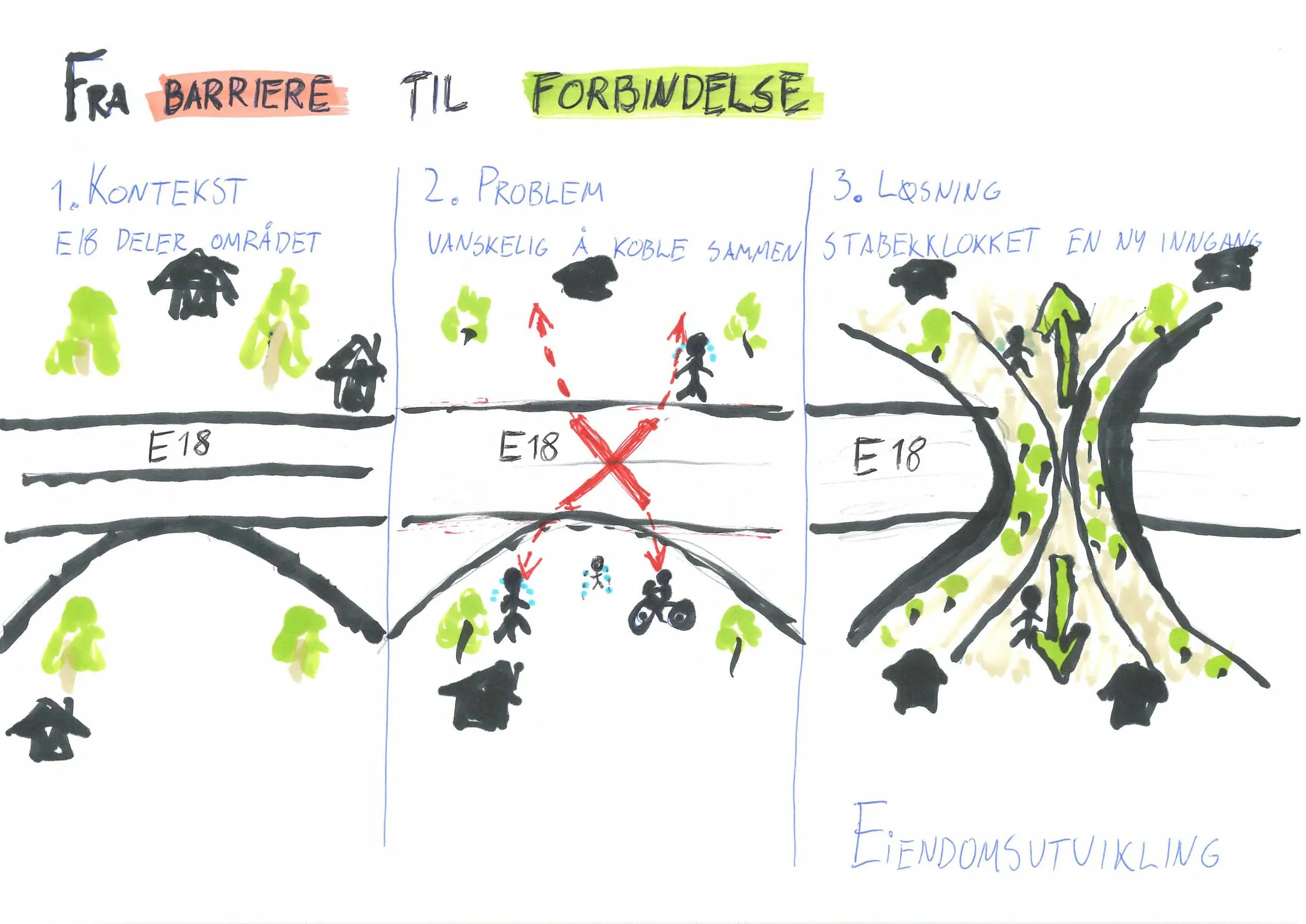
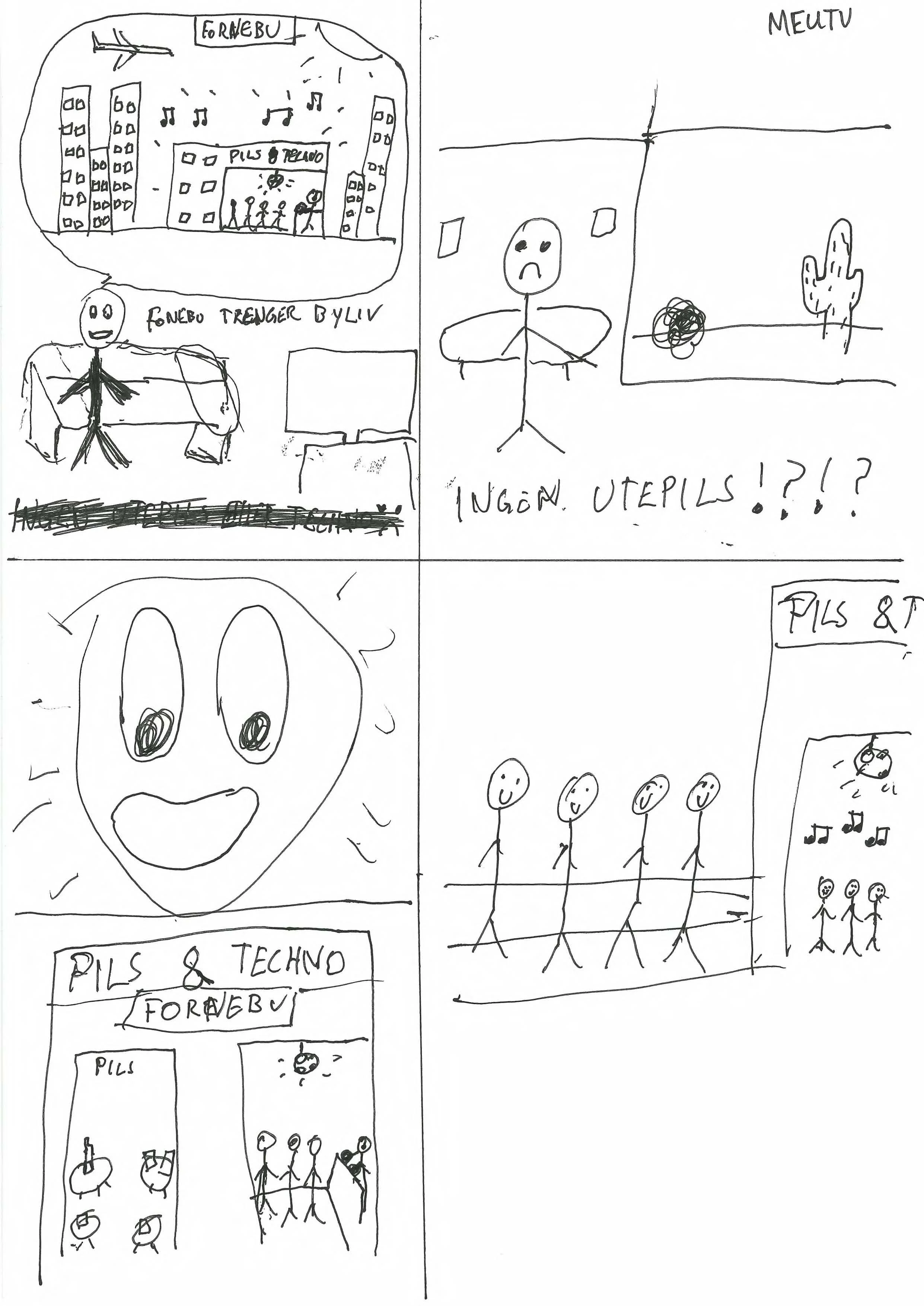
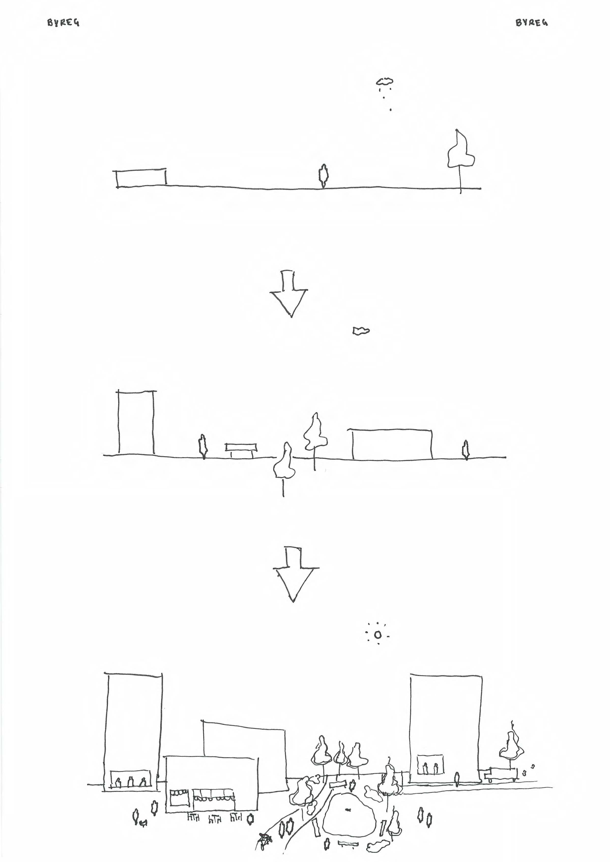
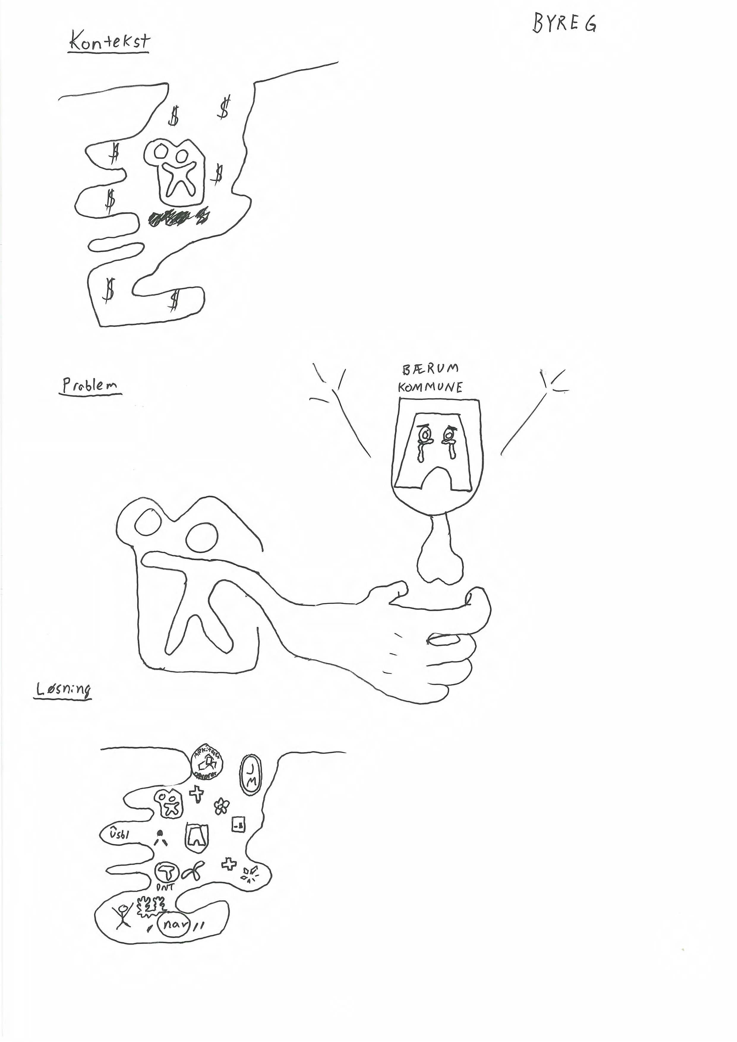
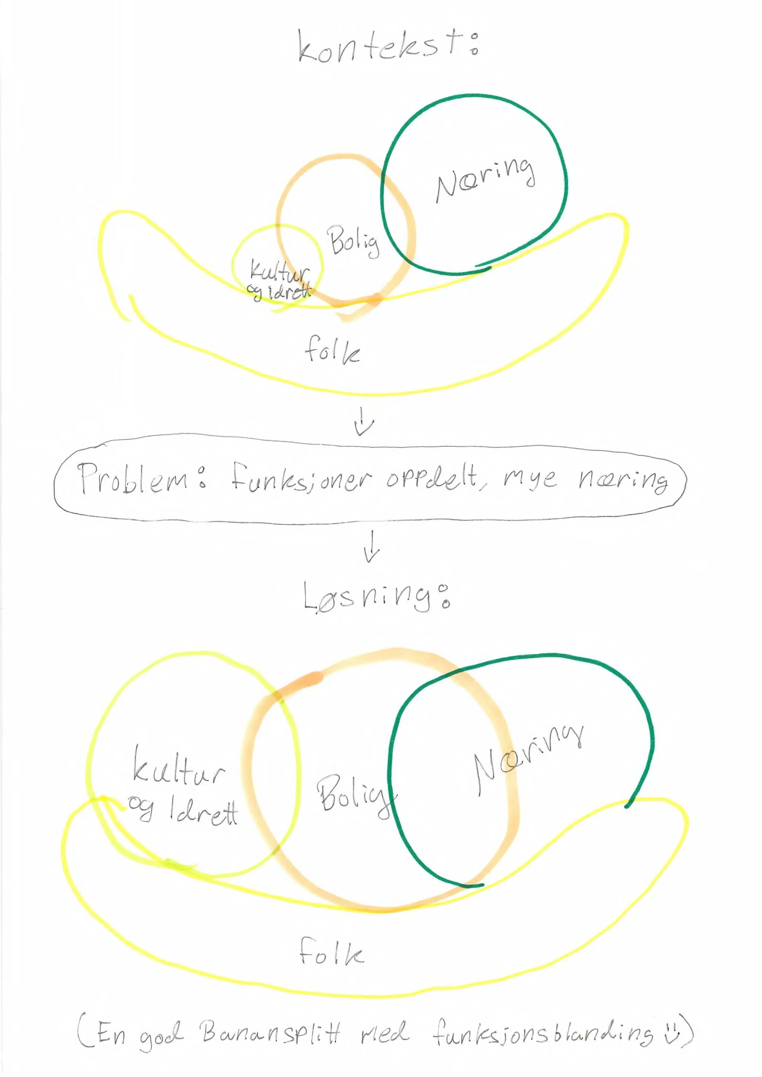
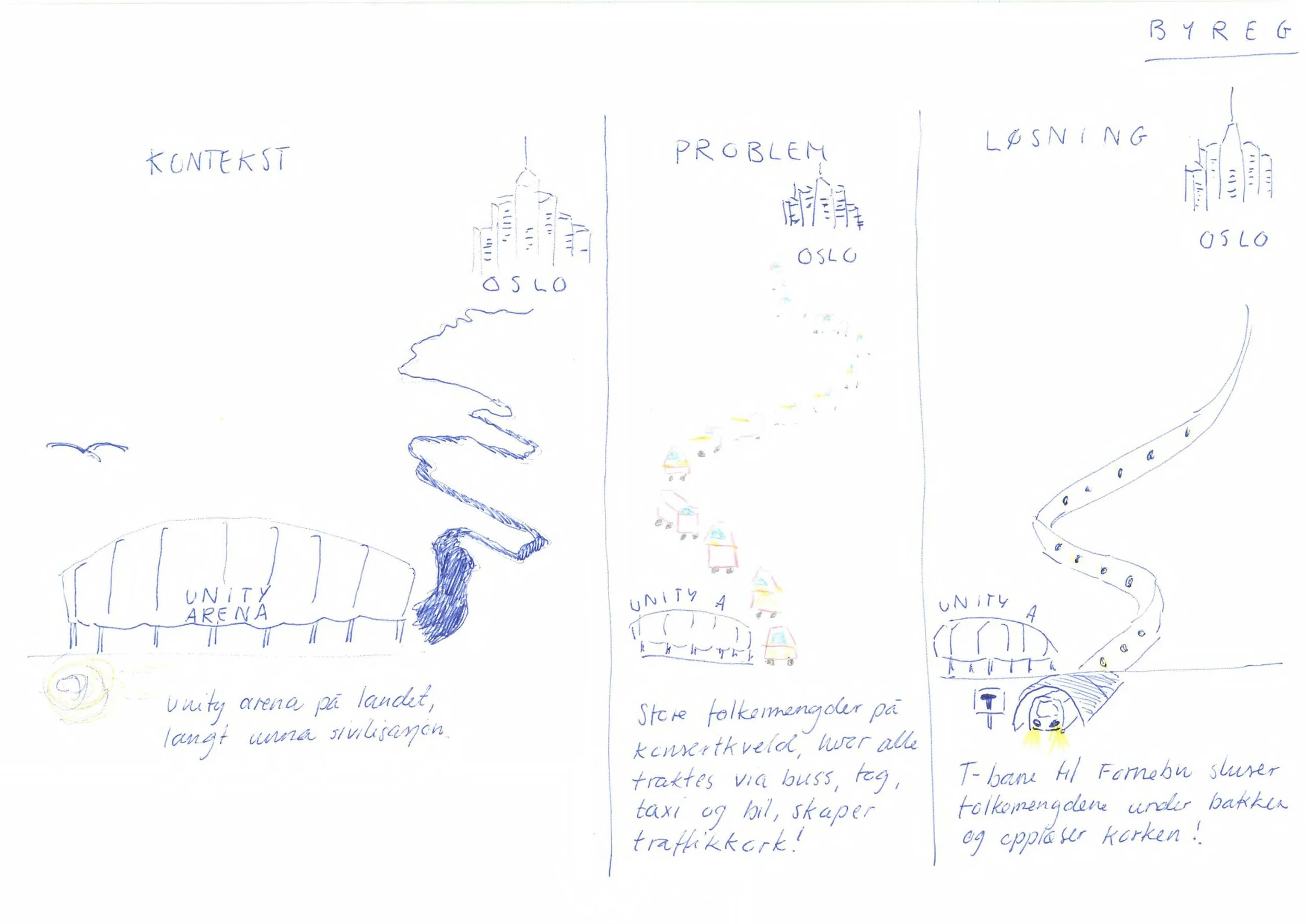
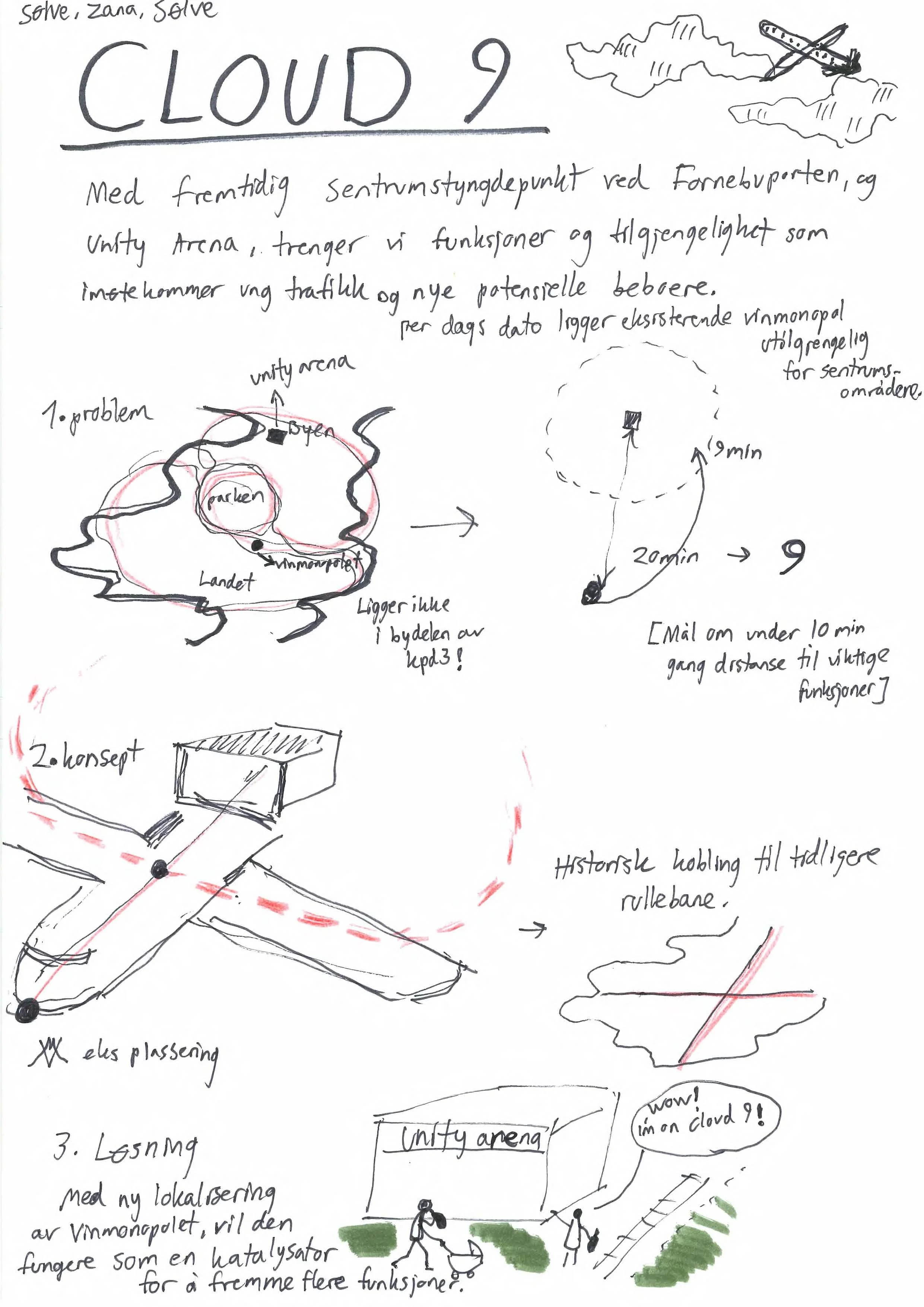
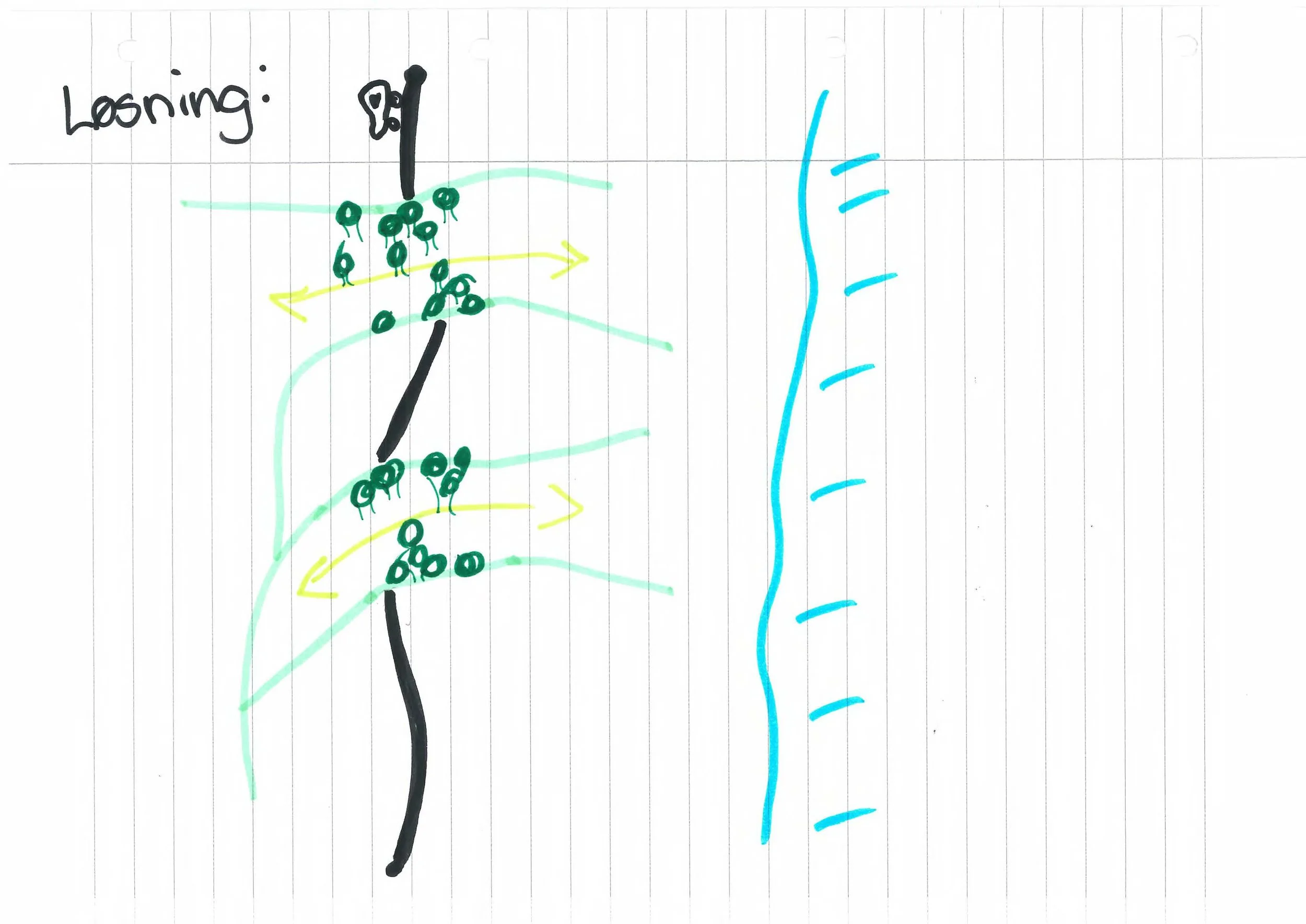
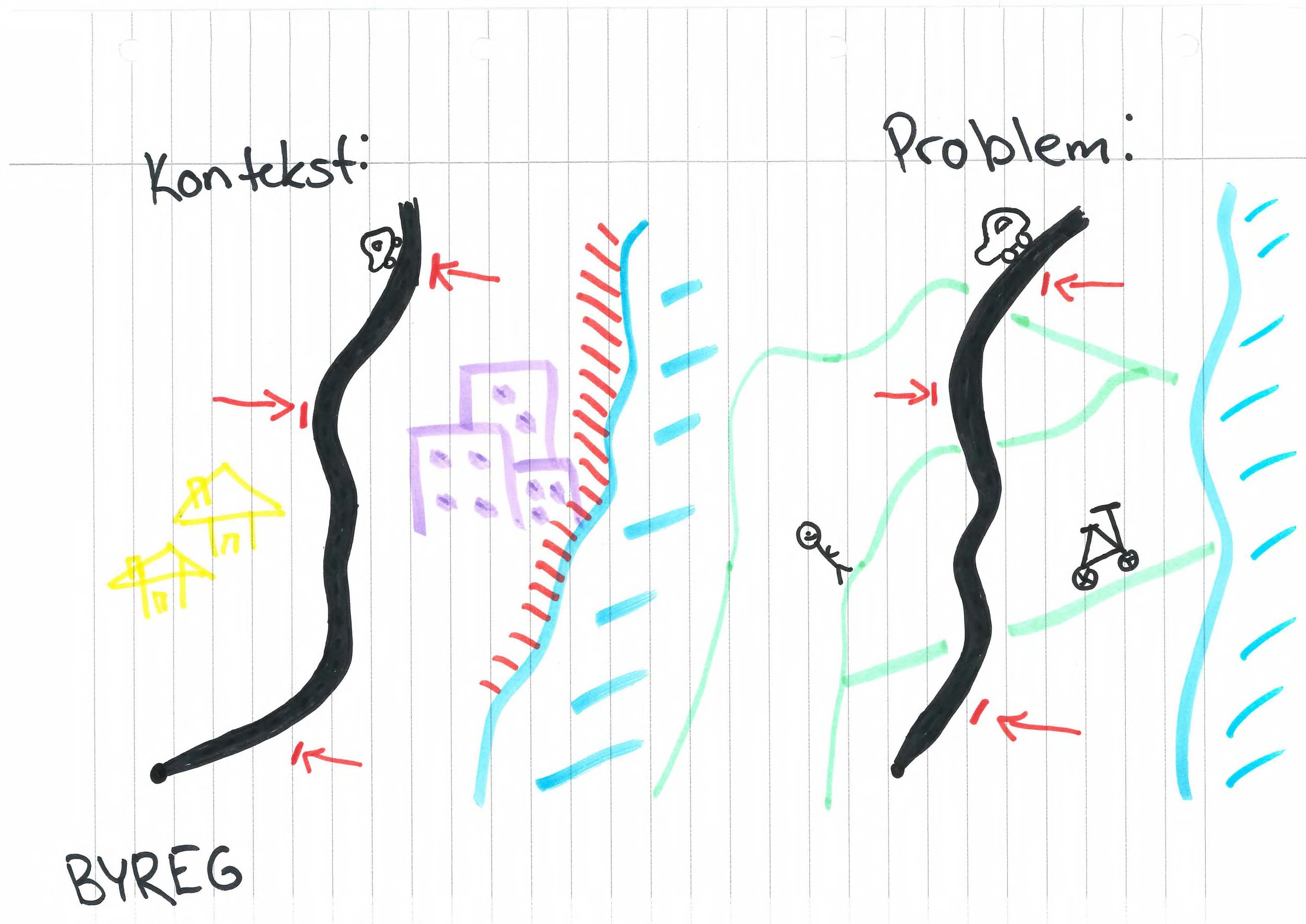
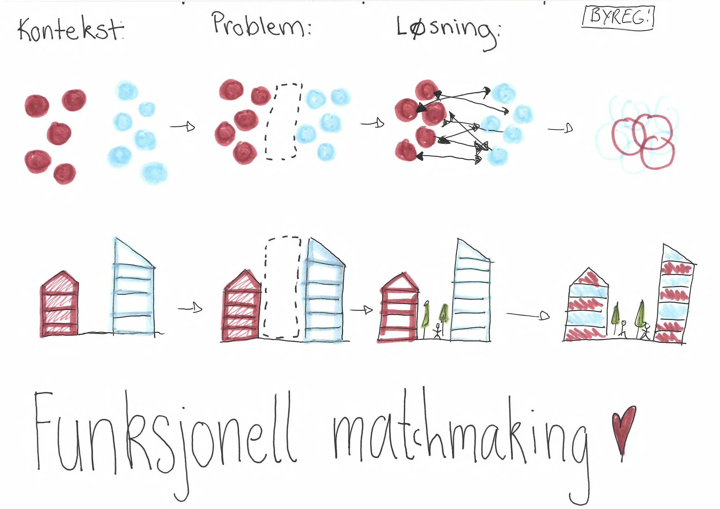
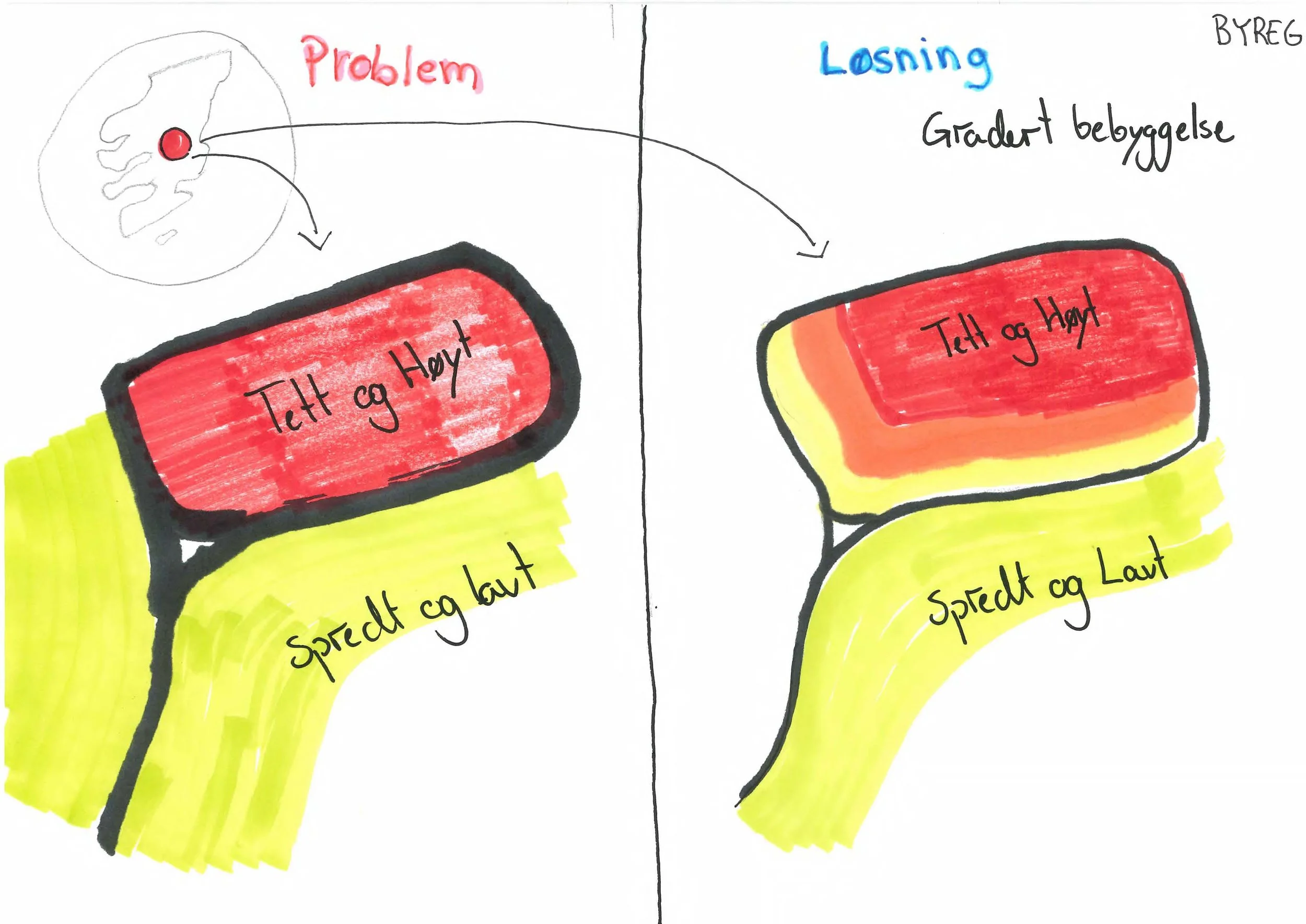
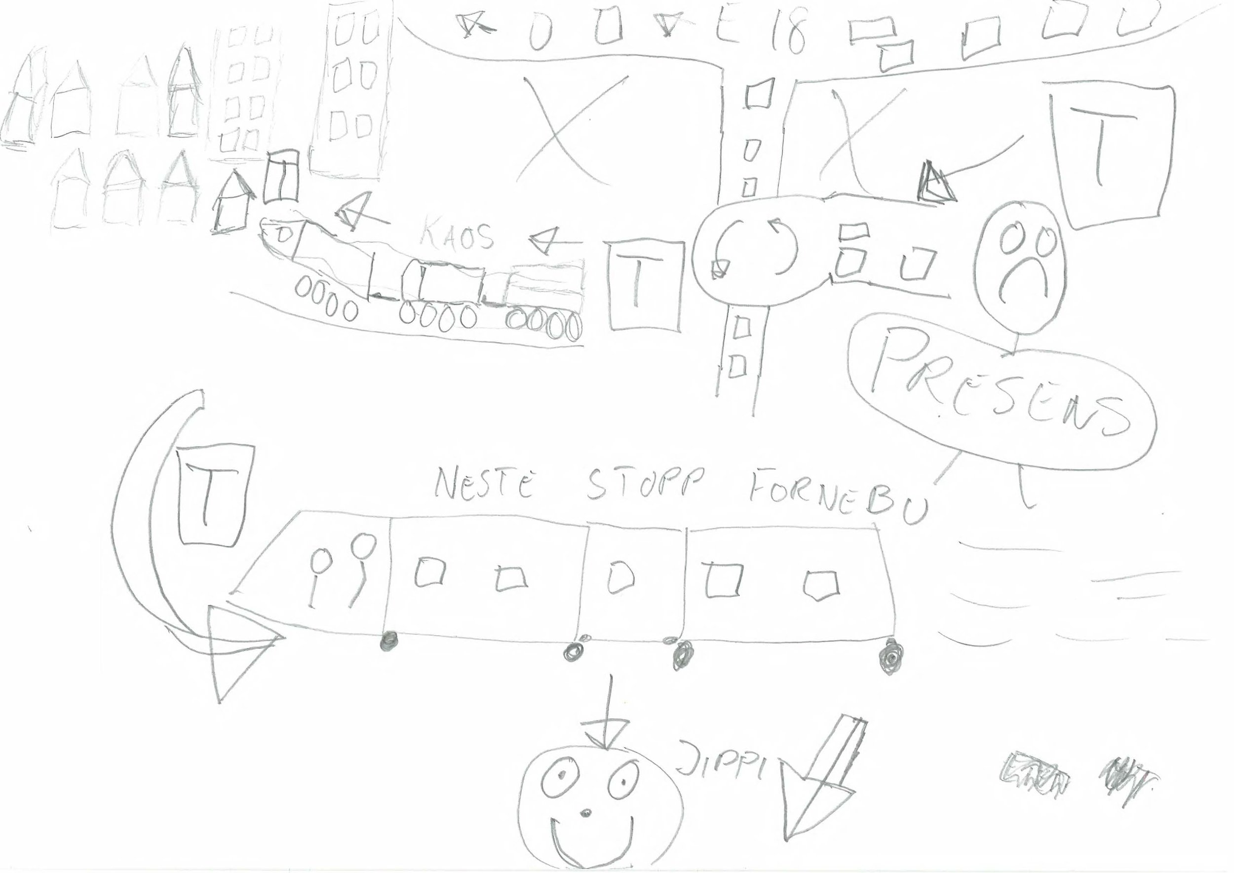
This lecture, is a culmination Tin’s experiences, and was developed at CityStudio Oslo a bachelors’ course, and at Den Kulturelle Skolesekken, an arts program for elementary to upper middle school. The lecture presented at LAA350 has been revised to fit into the curriculum. Later on, Tin also takes inspiration from Edward Tufte, the Yale professor emeritus and something of a high priest of information design. As this short video makes clear, Tufte’s devotion to explaining things visually extends well beyond charts and books: it even includes a giant metal fish sculpture. Tin cannot promise the students a giant metal fish. He can offer them a pencil, a sheet of paper, and a chance to make their ideas visible.
-
The course LAA350 - Projects in Urban Planning is a 20 ECTS course, focusing on the urban development of the city centre in the medium-sized city Kongsvinger. The course encourages studies of structures, massing and in-between spaces. LAA350 was conceived and previously led by professor Elin Børrud, before her departure this year. The teaching staff consist of Anja Standal, the new course responsible (BYREG), and Tin Phan (EIEJUSS)
-
2h, 20min
-
Anja Standal, BYREG
Tin Phan, EIEJUSS -
Scans
Task -
